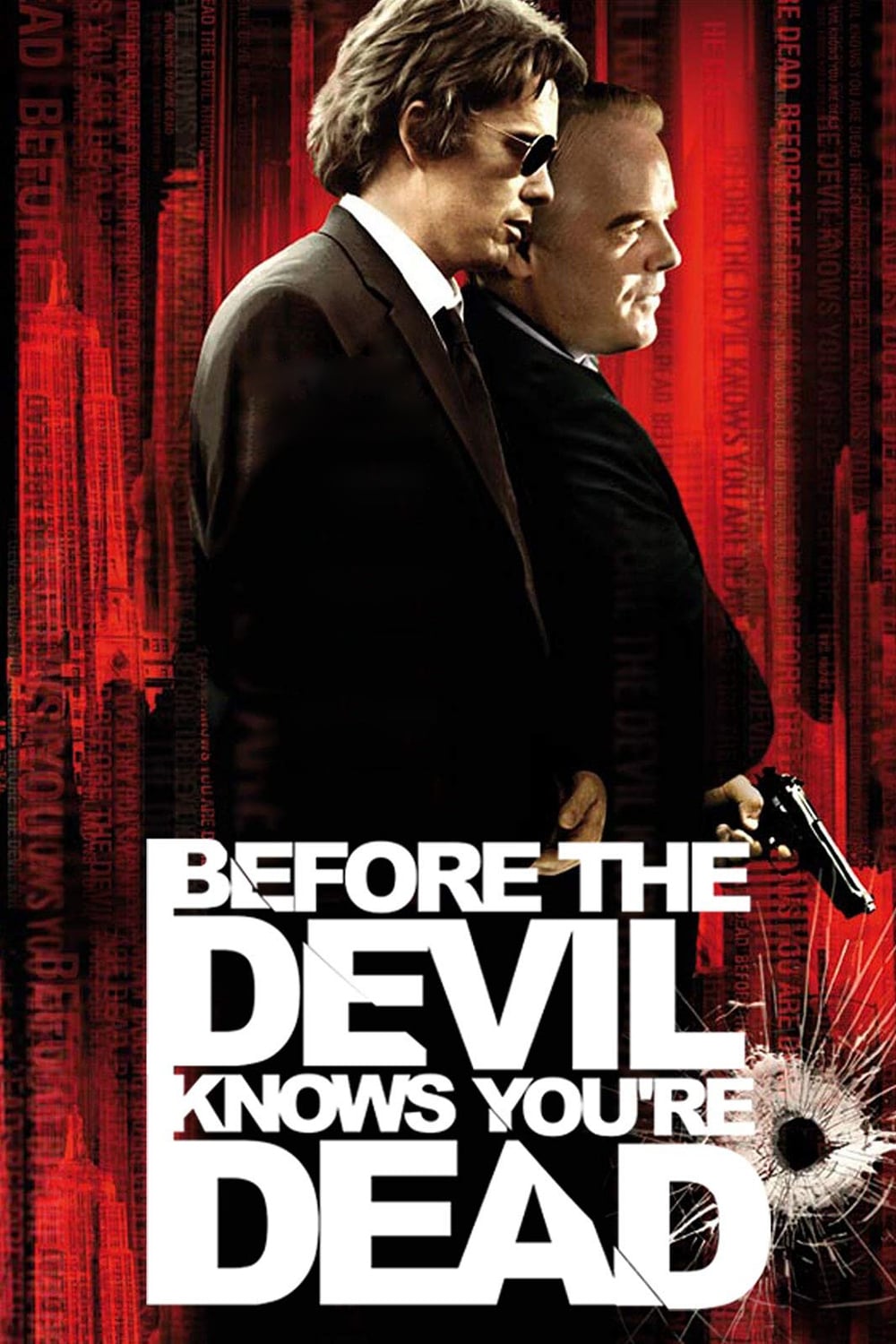
When two brothers organize the robbery of their parents' jewelry store, the job goes horribly wrong, triggering a series of events that send them and their family hurtling towards a shattering climax.
29 Jun Before the Devil Knows You’re Dead (2007)
Space
There are from time to time successful presentations in the sense that the characters work. You understand them well enough to have some genuine acceptance of their reality as humans, but that means you realise that there are things going on that do not have straight-line causal mechanics. This inscrutable humanness gets you past the limits of cartoonishness where you are told everything and why.
Sometimes those characters weave narratives that are rich and engaging. Because you invest but cannot anticipate, each unfolding of consequence tumbles you further into the story if it is rich. If you have several such characters and you are lucky enough that they ALL are weaving this reality, you get an environment of interaction rather than an object of one man’s life thread.
Few, very few films get past this threshold. Lumet’s gift is that he understands this woven environment in terms of space. When he tells us a story, the narrative cues come verbally as usual; the story proper is advanced through facts and sequence this way. This gives the actors something to do, some opportunity to contribute. Since Lumet often chooses well, this pumps juice into the structure. But his talent is in how he architects the space. The man is an architect of woven, partially discovered causal space.
One of his tools is the eye. Is there anyone else who drives the camera with such an ability to discover a path of comprehension just a fraction of a moment before we need it but after we have anticipated where he might go? Is there anyone else who can make the camera a first class character, equal in the dramatic action to the characters who thread their tragedy in fine, sculpted tangles? You knew this was the man’s talent from the very first in “Angry Men,” where he had the discipline to keep the characters stationary while he wove his spatial discovery with the eye.
The camera, even the camera of “Wiz,” is his narrative caress that incidentally perceives.
The other tool is time.
Usually he works with an unrelenting rolling of time. Time factors as an external force, an ocean that he and characters surf. I still get narratively aroused recalling the steamed beginning of the locomotive in “Orient Express,” and the avalanche of threading it drove.
Thank god creative souls are motivated to keep working beyond what ordinary drudges believe is the age of rest. Thank god the man still has the balls to take risks and grow. Here he decides to not allow time to be merely an external flow within which the characters braid, but as a designed skein in the knot itself. The time is sculpted in just the same way as the space. It is so well integrated a vision that I am sure he designed the non-linearity and not the writer, who would not have known the shapes he would have seen.
Noir is a matter of this relationship: the external cosmos as an unfortunate artefact of our status as voyeurs, imposed on characters who have little scope. The noir tragedy is the shape the characters make within these constraints, driven by the dynamics of folding. What Lumet has done here is dissolve that by making the river go away to be replaced by hoses that are not external, but in the thing. Genius.
There is a scene, pointed out to me by someone that matters, that crystallises this. Hoffman’s character is at the point where his control over the environment has just been lost. Afterwards he will be in the knots, not tying them. He takes a bowl of polished stones and slowly pours them on a glass table. They fall in a complex, beautiful, exhaustingly sad way. Lovely, chaotic, seen from the same set of camera angles Lumet has used until that moment. Afterward in the film, he would use a different set, regardless of whether past or future. (The bedclothes have just been removed as well.)
The man’s instincts are good, artistic, nourishing. But he still takes the annoying dive into the vulgar pool of image tropes. The last scene here with Albert Finney’s character, walking into a whiteout is so out of place, so hackneyed that I wanted to shake the filmmaker. This is right after the complex, delicate, perfect scene where the father’s heart is presented in the place of his doomed son.
This is important filmmaking, important stuff, life. Sydney, keep sleeping with the muse. Keep waking her up. Again.
Posted in 2010
Ted’s Evaluation — 3 of 3: Worth watching.


No Comments