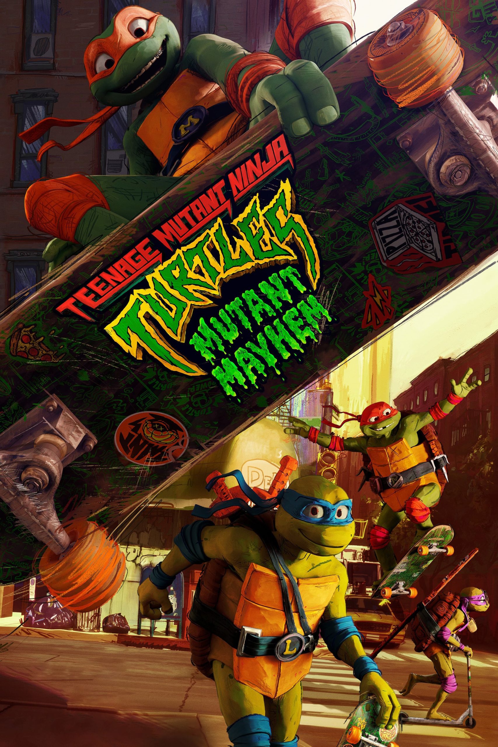
After years of being sheltered from the human world, the Turtle brothers set out to win the hearts of New Yorkers and be accepted as normal teenagers through heroic acts. Their new friend April O'Neil helps them take on a mysterious crime syndicate, but they soon get in over their heads when an army of mutants is unleashed upon them.
05 Sep Teenage Mutant Ninja Turtles: Mutant Mayhem (2023)
Inside the Lines
In most respects, this is a conventional film. It has a lot of story, more than one dynamic development, and character portrayals way beyond the normal. Its conventionalism is also reflected in the father dynamic, pervasive these days, the social message of antiracism, and the standard final monster battle. A few jokes.
What makes this a bit unusual is the novel graphical style. Curious. I recently commented on ‘The Boy, the Mole, the Fox and the Horse’ which was in an animated watercolour style where the outlines were rough ink and the colour strewn inexactly. I thought it amazingly effective.
The recent Spiderverse films opened the door for innovation in mainstream 2d animation. This film is placed between them, except the outlines are more grunge than meditatively graceful. I think it is intended to convey situated energy. If the ‘artist’ endows the world with such energy, we feel it.
I also think that we are seeing an effect where the less human they are depicted in the drawing style and reverse anthropomorphism, the more humanity we allow ourselves to place in the characters. It worked.
The same thing works with the editing style. The pace was fast cuts, especially at the fights. It is only a little more intense than Bay does, but the less we actually see, the more exciting the fight.
The one thing that almost killed this for me — you’ll never guess and once I tell you it could ruin the movie for you. The energetic outlines of the characters aren’t part of the animator’s artistic intent. They are computer generated and overlain on conventionally rendered (Pixar style) characters. This is easy to see, especially in the poster art that does not have the effect.
The thing is that it is applied unevenly through the film, as if a decision was made to grunge it up but they did not have time to process the whole thing. So we have some turtles that look like claymation (my 10 year old thought much was in fact claymation) — and other sections that look overly scribbled upon. It seems random.
Posted in 2023
Ted’s Evaluation — 2 of 3: Has some interesting elements.


No Comments